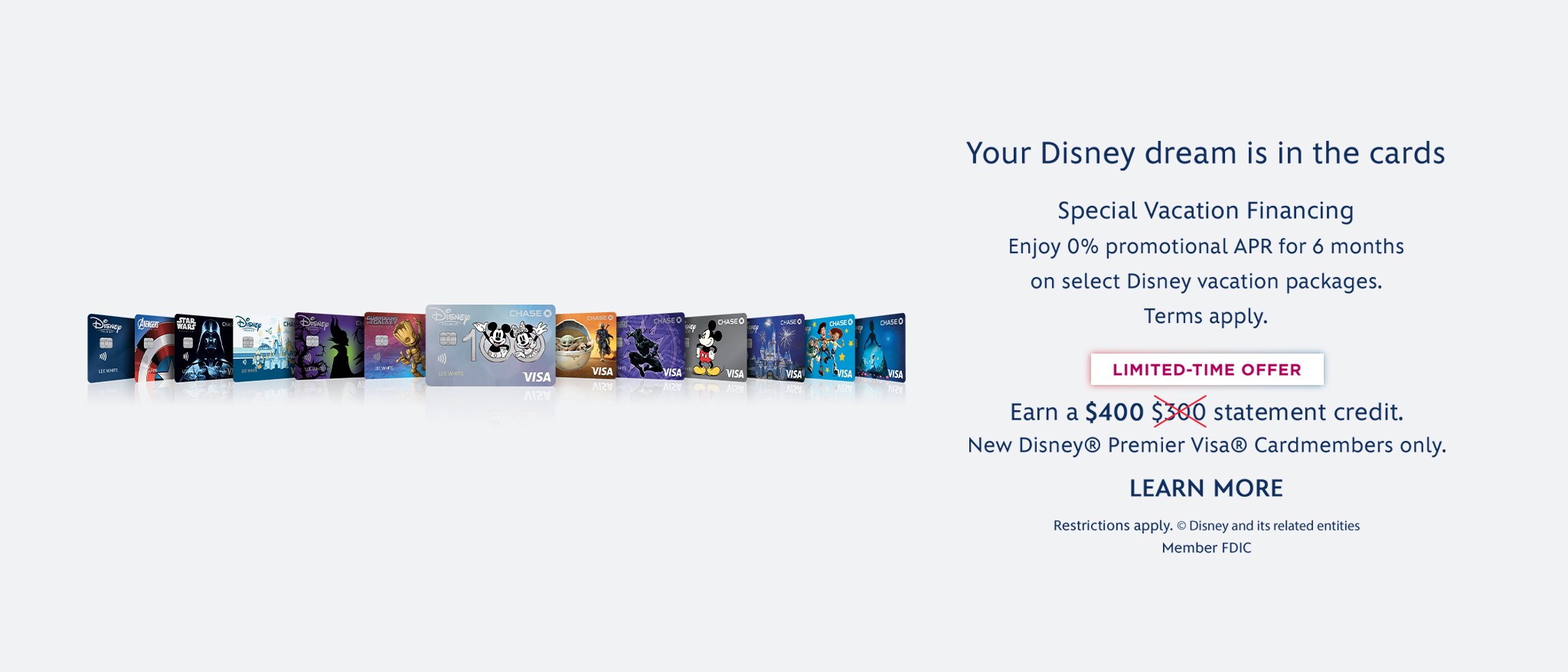
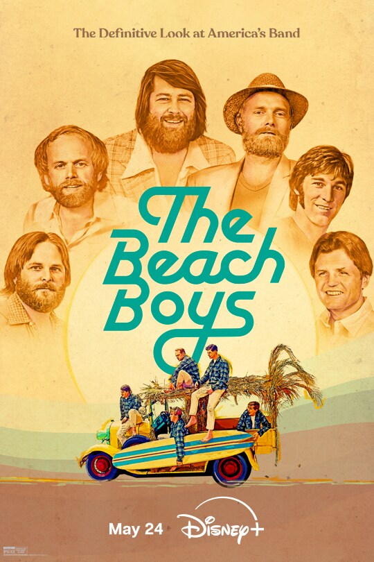
The Walt Disney Family Museum

Museum Resources

FEATURE EXHIBIT

"SLEEPING BEAUTY" AND "101 DALMATIANS"
Excerpted from the essay "After Bambi" by Christopher Finch

"Sleeping Beauty" (1959) had been in development since the completion of "Cinderella" -- at least, and at first Disney seems to have seen it as his ultimate statement, certainly so far as fairy-tales were concerned. "Sleeping Beauty" would complete a trilogy begun with "Snow White and the Seven Dwarfs" and carried forward by "Cinderella." To emphasize its importance, an enormous amount of effort was lavished on production design, and this is where the trouble began. As inspirational sketches and paintings began to appear, Disney was particularly taken by examples produced by Eyvind Earle who had joined the Studio as a background artist in 1951.

Earle's strong suit was stylization and these studies evoked a graphically strong but sentimentalized gothic world -- part oversized illuminated manuscript, part comic book tapestry. Excited by these conceptual works, Disney began to envision a film that would bring the medieval world to life in its own terms. This, he seems to have thought, would be an innovative film, one to compare with "Snow White and the Seven Dwarfs" and "Pinocchio."

On screen, Earle would be credited as color stylist, but his influence went far beyond that. Based on his studies, the backgrounds devised were busy and mannered, a fact that became exaggerated when the decision was made to produce the film in a 70mm wide screen format. To read effectively against these fussy backgrounds, the characters had to be animated in a stylized way that simply emphasized the overall mannerism. The whole movie has a decidedly two-dimensional look, the opposite of what is called for in an animated feature, and only animator Marc Davis's Maleficent managed to rise above the mediocrity. Walt Disney himself became frustrated with the film long before it was finished and turned his interest increasingly to Disneyland and other projects.

After "Sleeping Beauty" (which cost over six million dollars, then a colossal sum), Disney's animation department turned to a less ambitious production, "101 Dalmatians," which would be released in 1961. One thing that would make this movie economically viable, even with all those Dalmatians on screen, was that Ub Iwerks -- the man who had first animated Mickey, and now the Studio's special effects wizard--had invented a modification of the XeroxTM system that allowed animators' drawings to be photocopied directly onto cels, thereby eliminating the need for inking.

This system would save considerable sums of money, but it did not provide the delicacy of line that had come to be taken for granted. Animators did not mind too much because photocopying preserved more of their draftsmanship, but at first the system provided a nightmare for art directors who had to work in a new way that emphasized line over everything else.

It can be assumed that Walt Disney had approved the use of this system, and must have had a good idea of what it implied from an aesthetic point-of-view. Even so, when Ken Anderson showed him his preliminary designs for "101 Dalmatians," Disney blew his stack. This did not look like Disney animation! It was crude! Nobody would want to see this movie!

For once Disney was wrong. The artists had no difficulty in adapting to the new technique and the audience felt quite at home with Anderson's design concepts. The XeroxTM look may have been less subtle than the old hand-inked look, but it was also more spontaneous and somehow more contemporary. "101 Dalmatians" was a box-office hit and the Studio's reliance upon photocopied cels would last for almost three decades.

 
Multimedia
Requires RealOne Player